This was a self-initiated redesign of the mobile banking app for VÚB Bank, the first bank I used. The app felt visually outdated and difficult to navigate. My goal was to retain all existing features while making them more accessible, intuitive, and visually appealing for both tech-savvy users and those with less experience.
Role and Scope
I was the only designer involved, covering the full process from initial exploration to high-fidelity design and testing. Since this was not a commissioned project, I had no access to business requirements or analytics. I based my decisions on competitor benchmarks, my own usage, and conversations with four long-term users from my family.
Problem Statement
- Overloaded screens and unclear hierarchy
- Disorienting navigation structure
- No clear prioritization of frequently used features
Research and Insights
I conducted informal interviews with four users who actively use the VÚB app. They often struggled to locate common functions or understand where they were in the interface. I also compared the VÚB app with other mobile banking apps I use, identifying common patterns and usability gaps.
Design Goals
- Create clear and familiar navigation
- Elevate key actions and common use cases
- Maintain full functionality without overwhelming the interface
- Introduce a modern and minimal visual system
Design Process
I mapped common user journeys and designed wireframes aimed at simplifying navigation and highlighting essential actions. These evolved into a high-fidelity interface with a tab bar, contextual calls to action, and reorganized layouts. Less critical features were moved into drawers or grouped in accessible menus to avoid visual clutter.
Before and After Screens
Home
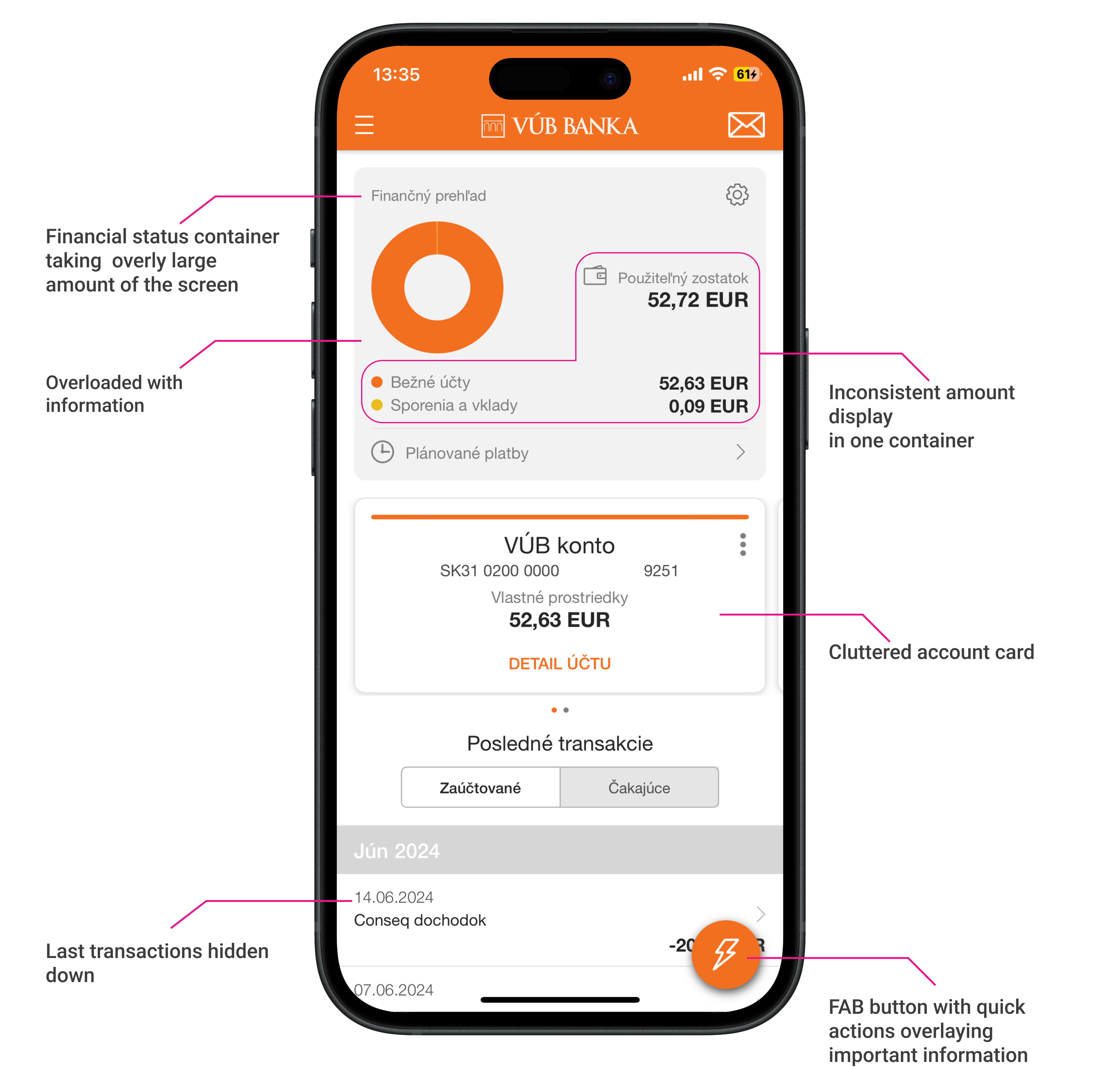
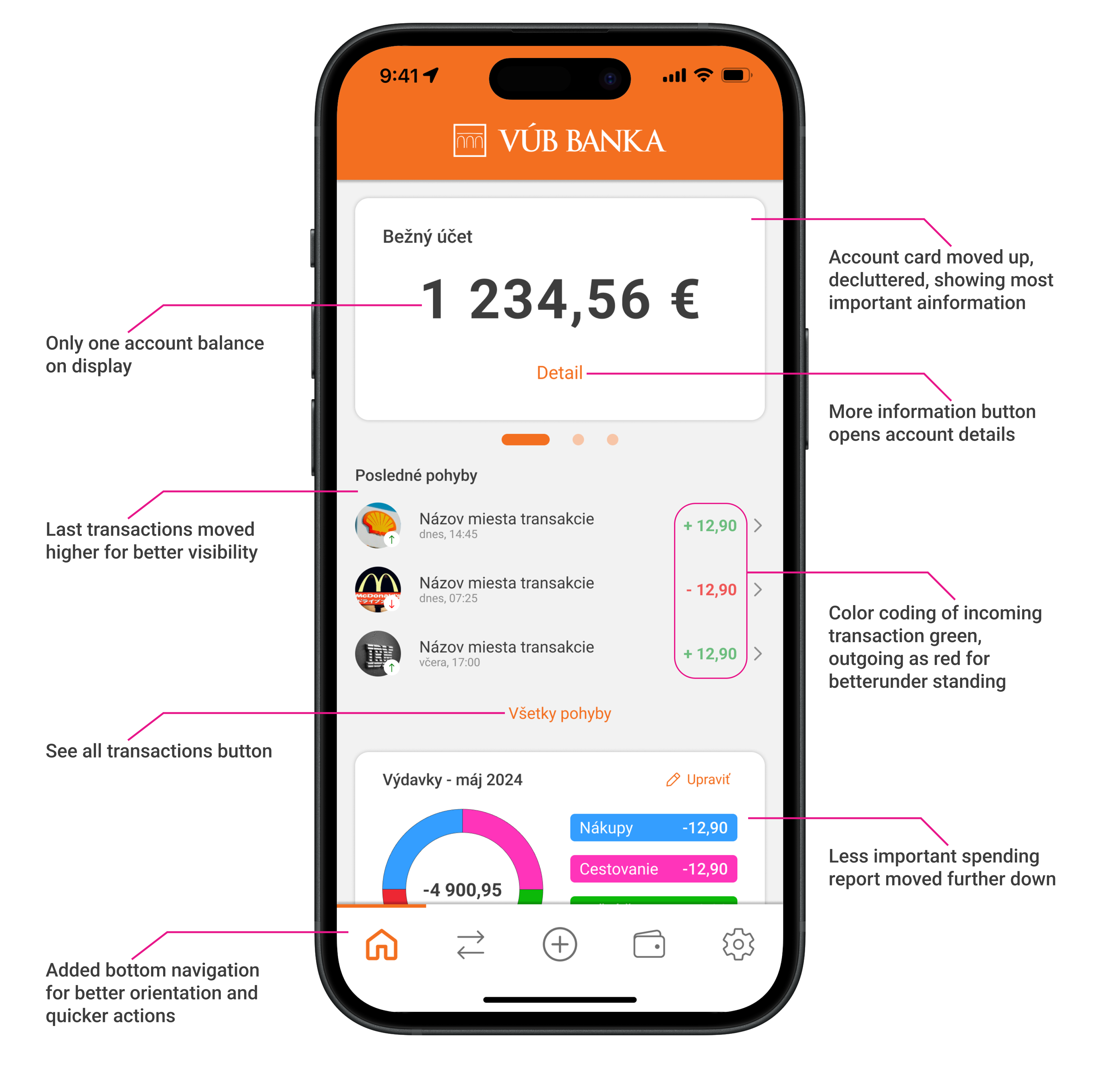
The original home screen was visually overloaded, with too many containers and unclear balance display. Actions were buried and inconsistent. The new version offers a single focused view, prioritizing hierarchy and visibility of recent transactions.
Account
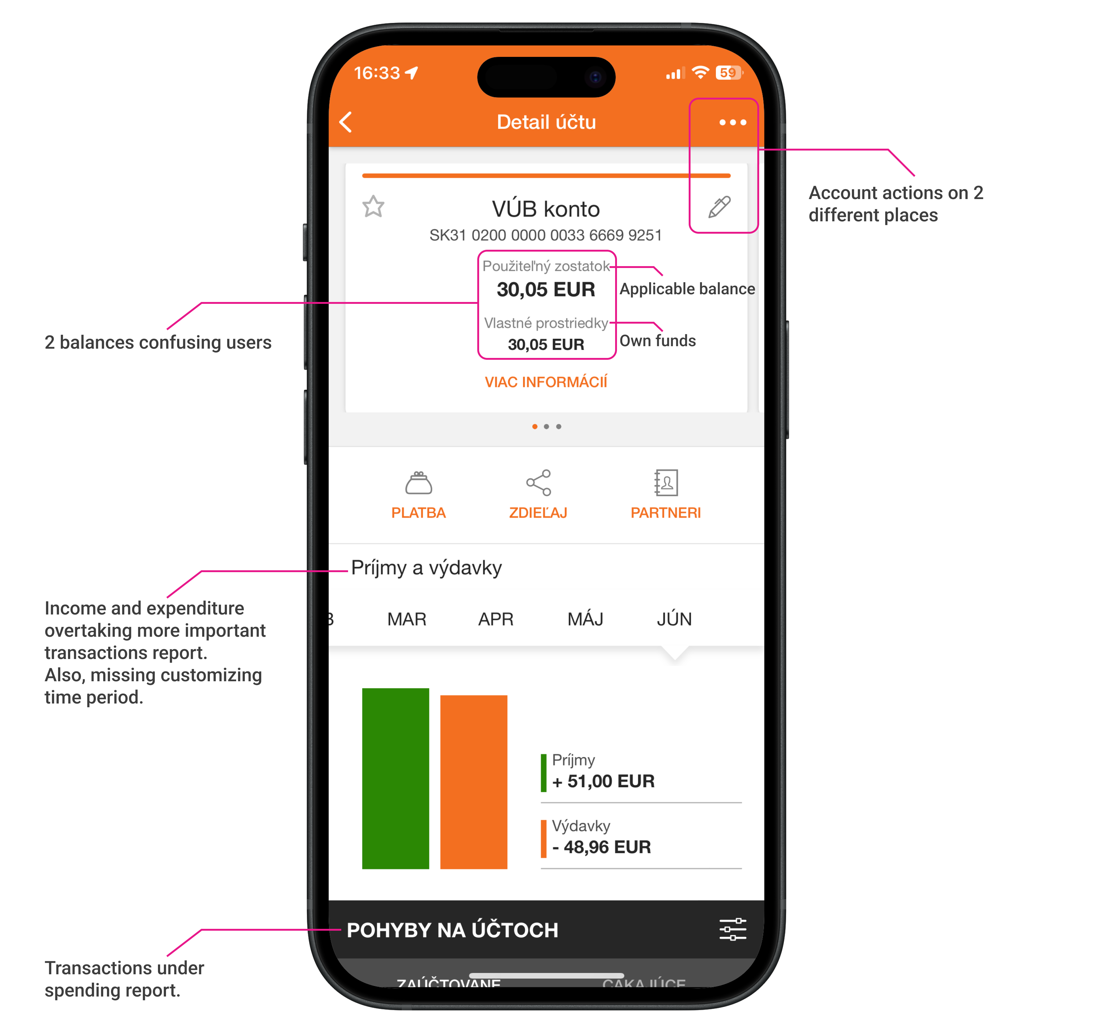
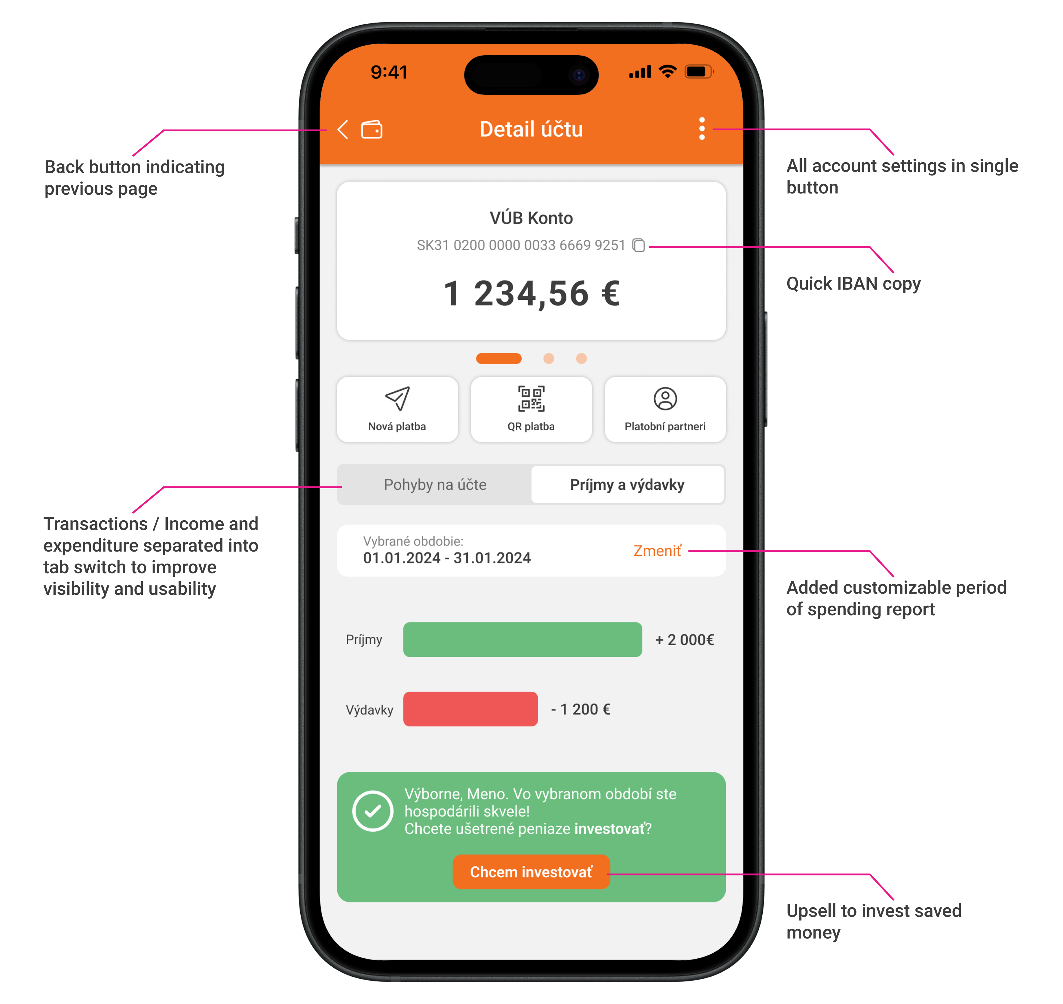
Account details were previously hidden in dense cards. In the redesign, balances are easy to scan and account actions are placed where users expect them.
Money Transfer
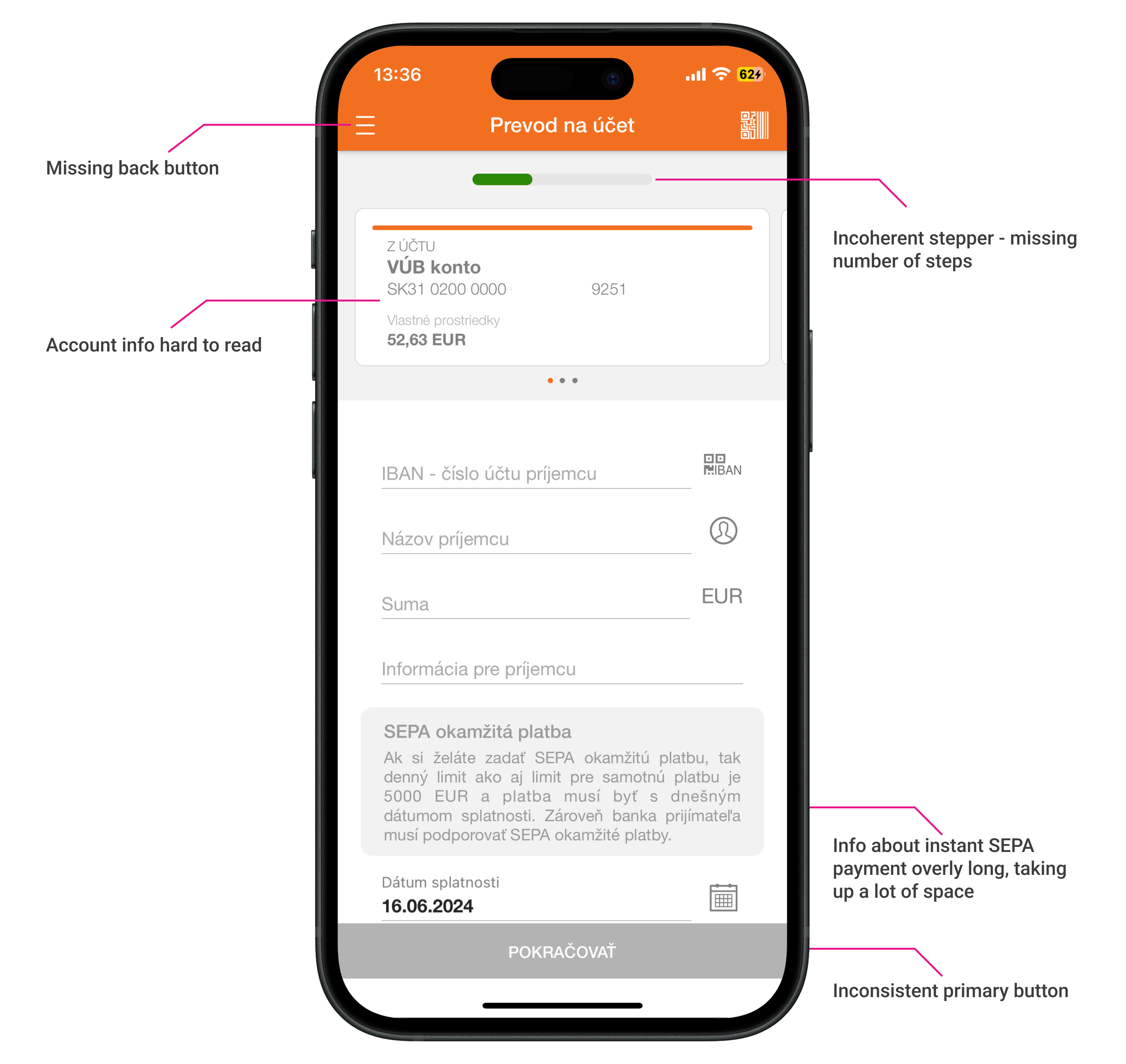
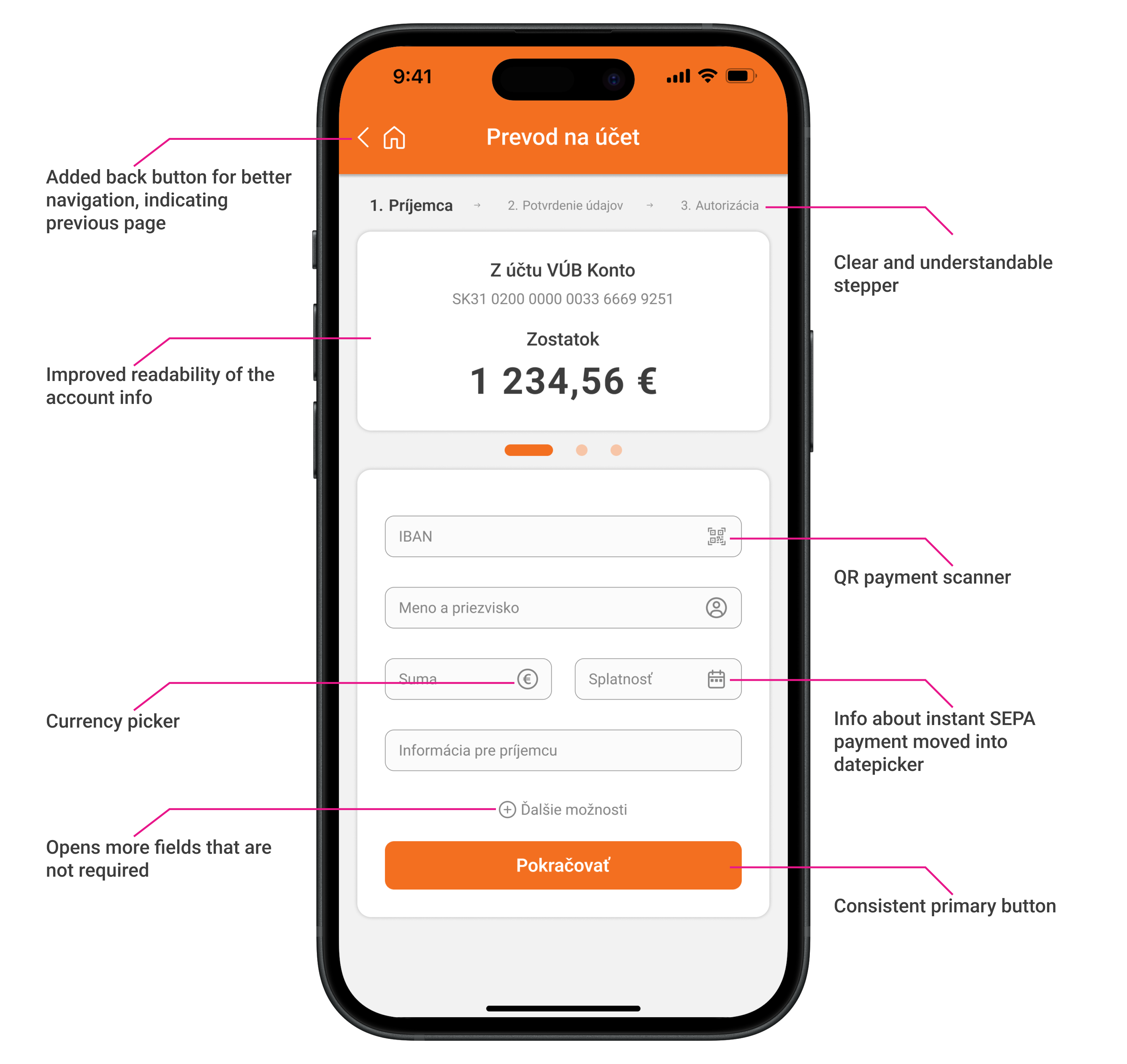
The original transfer flow was fragmented. The redesign introduces a clear, unified process with improved guidance and feedback.
Testing and Results
The redesign was shared with the same users interviewed earlier. Feedback was highly positive. They appreciated the visual clarity, better grouping of features, and improved ease of use. All reported feeling more confident using the app and described the experience as finally making sense.
Conclusion
This project was an opportunity to design without internal constraints while still solving real problems. It challenged me to think structurally, prioritize effectively, and build clarity into every layer of the experience.