Overview
Chisme started from a simple observation. I wanted to go for a beer one evening and had no one to join me. That got me thinking about a broader problem, and when I considered who might face it most, I landed on women. Mixed friendship apps tend to drift into dating territory, full of unwanted messages and uncomfortable dynamics. A women-only space built around real-life activities felt like a different and more interesting problem to solve.
I co-founded Chisme and led all product design from concept to launch and beyond. My co-founder handled development; I defined the product direction, designed every flow and screen, built the design system in Figma, and shaped the monetization model.
Before a single line of code was written, we validated the idea with Figma prototypes shared on Instagram and TikTok. We set a target of 100 pre-registrations in the first month. We got 85. Close enough that we decided to put money into ads to test whether real demand existed. Two weeks later we had 200 pre-registrations. We started building.
Chisme launched on October 20, 2025. Within four months, it reached 20,000 monthly active users, a 4.7 App Store rating, and subscription-based revenue.
Key impact
Problem
Two core challenges shaped the product. First, people rarely take initiative when it comes to meeting strangers. Even interested users tended to wait for someone else to go first. Second, even when users did join a plan, starting a conversation with someone they didn't know felt uncomfortable.
For the platform to work, it needed to address both: a clear way to discover people and activities nearby, a natural entry point for conversations, and an environment safe enough to actually try.
Key design decisions
Several early decisions shaped how the product works today.
Plan-based interaction model
Instead of swipe-based matching, Chisme is built around shared activities. Users create real-life plans that others can join. The shared context removes the awkwardness of messaging a stranger out of nowhere and gives conversations a natural starting point.
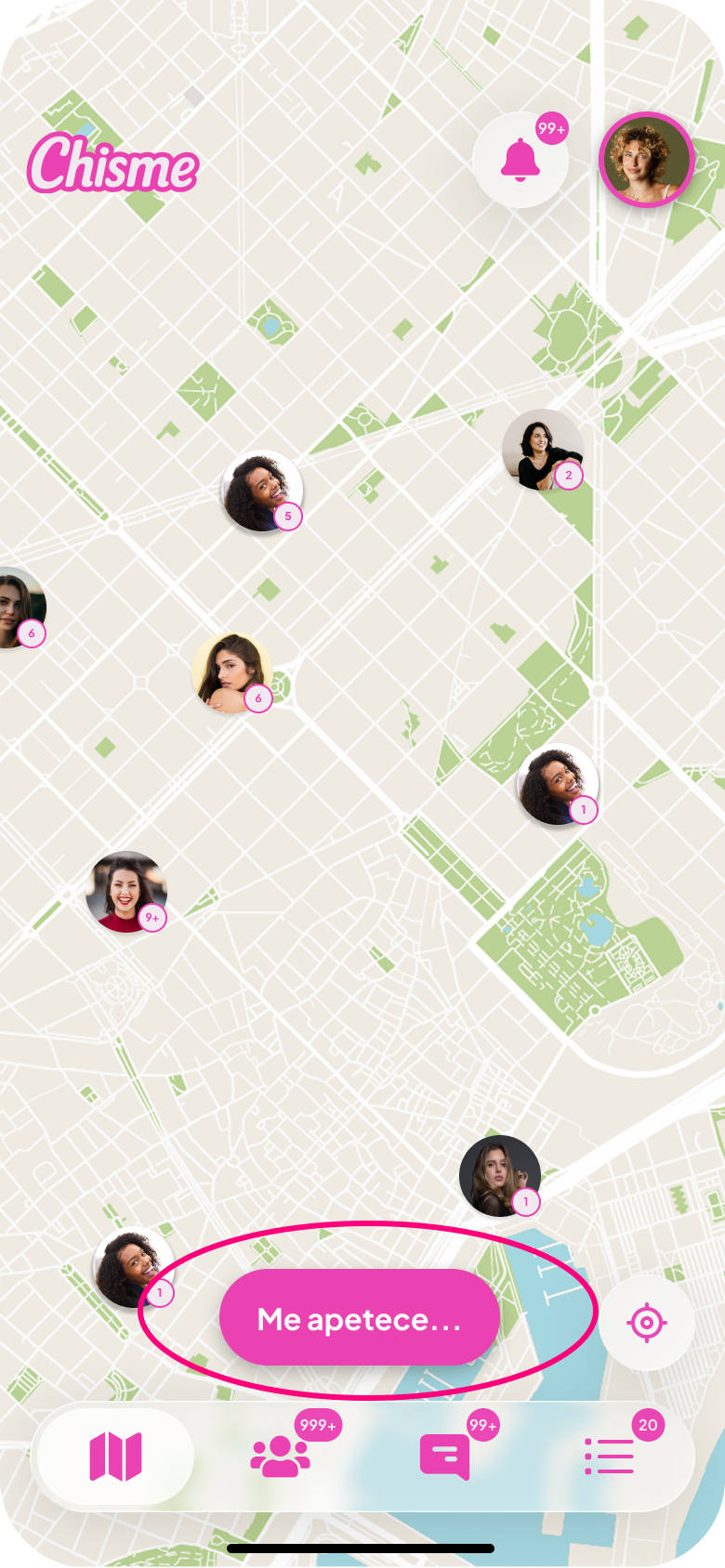
Encouraging initiative with contextual language
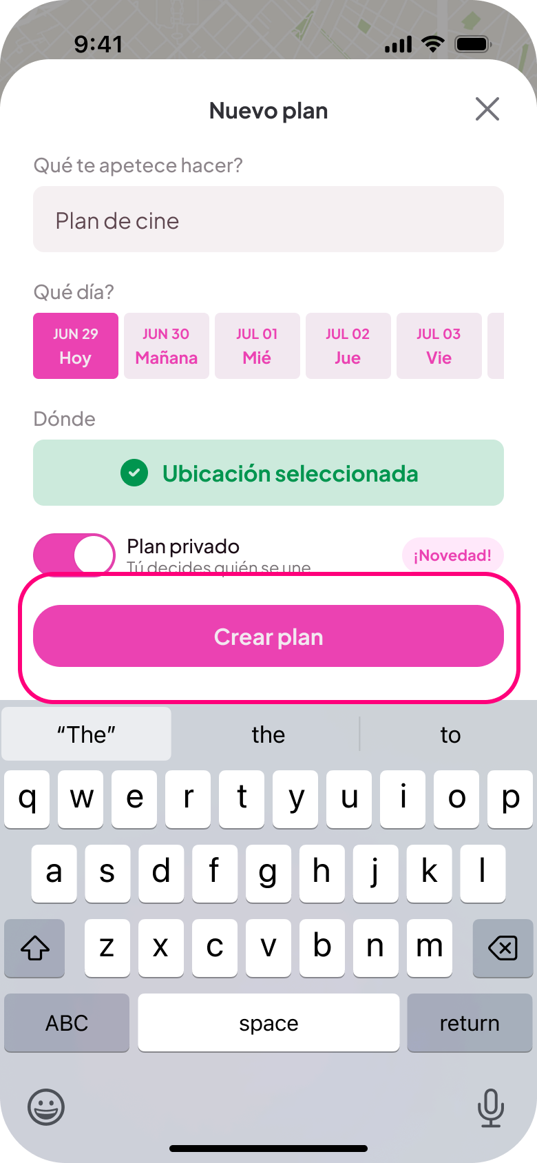
Early versions used a simple "+" button to create plans. Many users overlooked it. Replacing it with the contextual CTA "Me apetece..." ("I feel like doing...") effectively doubled plan creation. The change worked because it framed the action as expressing an intention, not committing to something.
Reducing conversation friction
Many users joined plans but hesitated to send the first message. Pre-written introduction messages let users start a conversation with a single tap, giving people a way in without having to come up with something to say.
Keeping plans time-bounded
Plans live until midnight on the day they're created. This keeps the product focused on spontaneous, same-day activity rather than long-term scheduling. It also keeps the feed fresh and reduces dead plans that never get joined.
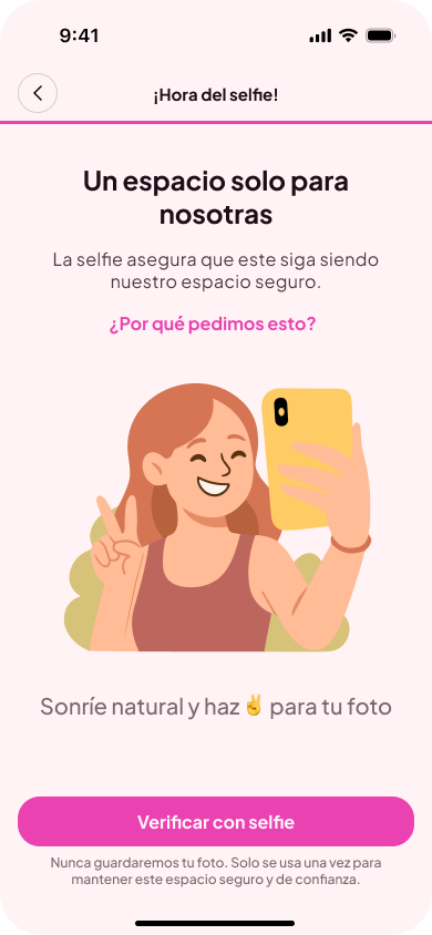
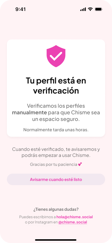
Safety through selfie verification
Selfie verification during onboarding is how the women-only rule is enforced. It adds meaningful friction for bad actors and signals to users that the community takes safety seriously.
Key product iterations
After launch, the product evolved based on user behavior. The following iterations address specific usability issues that emerged over time.
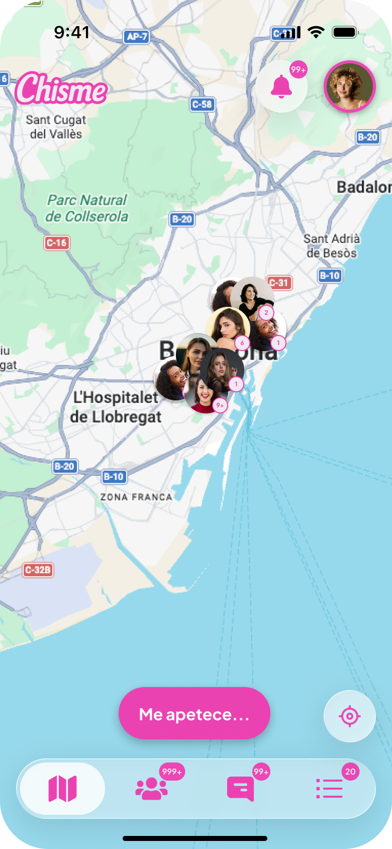
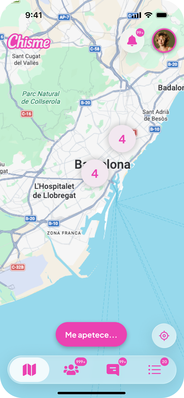
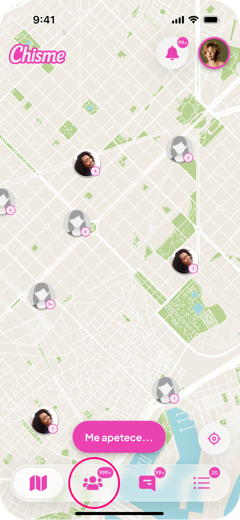
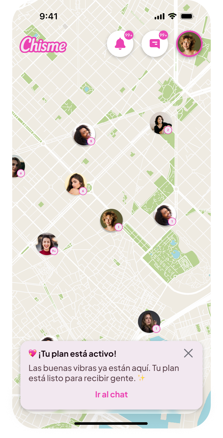
Improving map discovery
Early versions displayed every plan individually on the map; as plans grew, the interface became cluttered and hard to navigate.
Map clustering was introduced, grouping nearby plans when zoomed out. This improved readability and helped users understand activity density across the city.
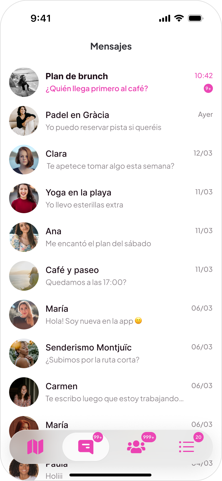
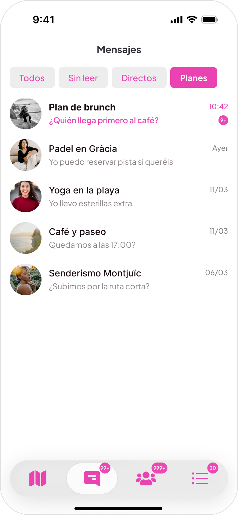
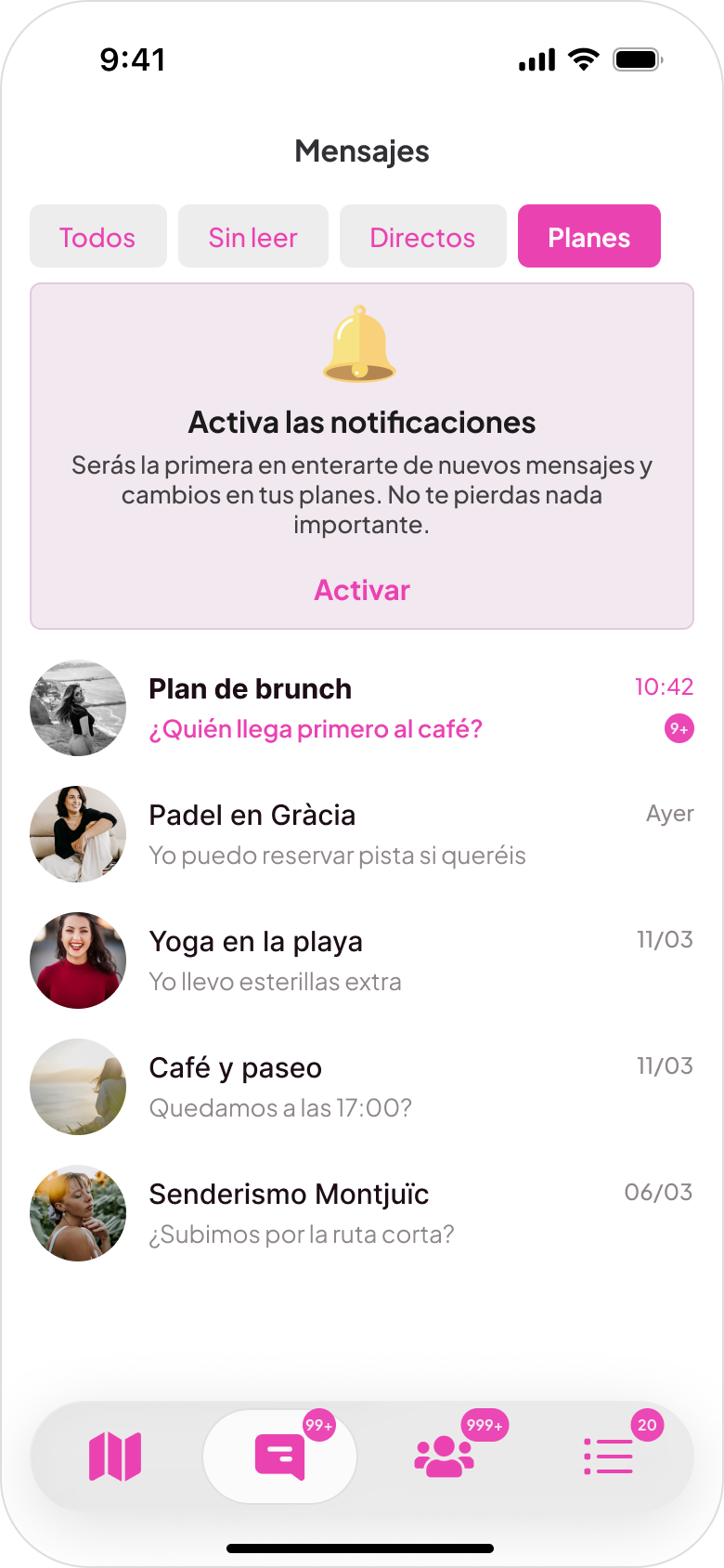
Reorganizing conversations
The initial layout was a single chronological list; as conversations grew, important messages were easily missed. A tab-based structure was introduced with four categories: All, Unread, Direct messages, Plan conversations.
Encouraging notification activation
Many users skipped push notifications during onboarding and missed conversations. A persistent notification card was added to messaging and notifications screens until users enable updates. Push opt-in increased from 47% to 62%.

Key product flows
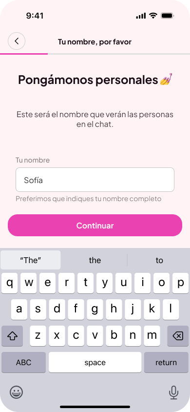
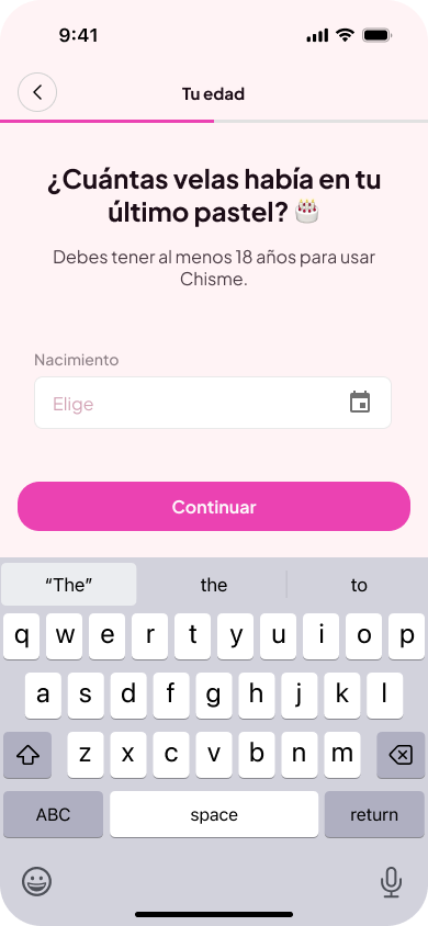
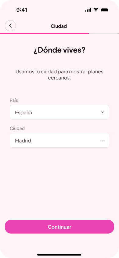
Onboarding flow
The onboarding collects a name, age confirmation, location, and a selfie. The selfie step is the most unusual and the most intentional: since Chisme is women-only, it's the primary way we verify who's joining the community. Completion rate: 75%.
Step 1
Enter name
Step 2
Verify age
Step 3
Set location
Step 4
Selfie verification
Step 5
Verification pending
People discovery flow
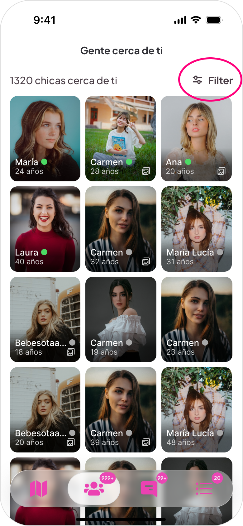
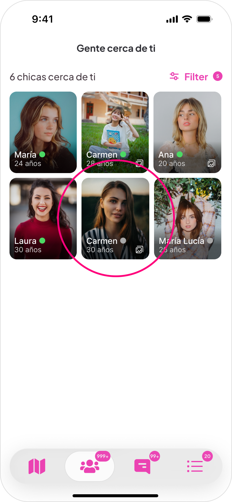
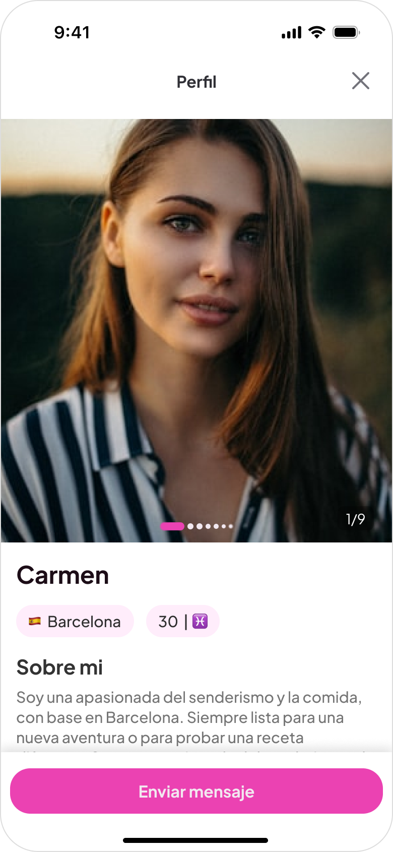
The map is the primary discovery surface because location is central to how the product works. Plans and people are inherently local, and a map communicates density and proximity in a way a list can't. Premium filters for distance, interests, and language let users narrow what they see. A list view organized by day is also available for users who prefer browsing linearly.
Step 1
Discover people nearby
Step 2
Browse nearby people
Step 3
Apply filters
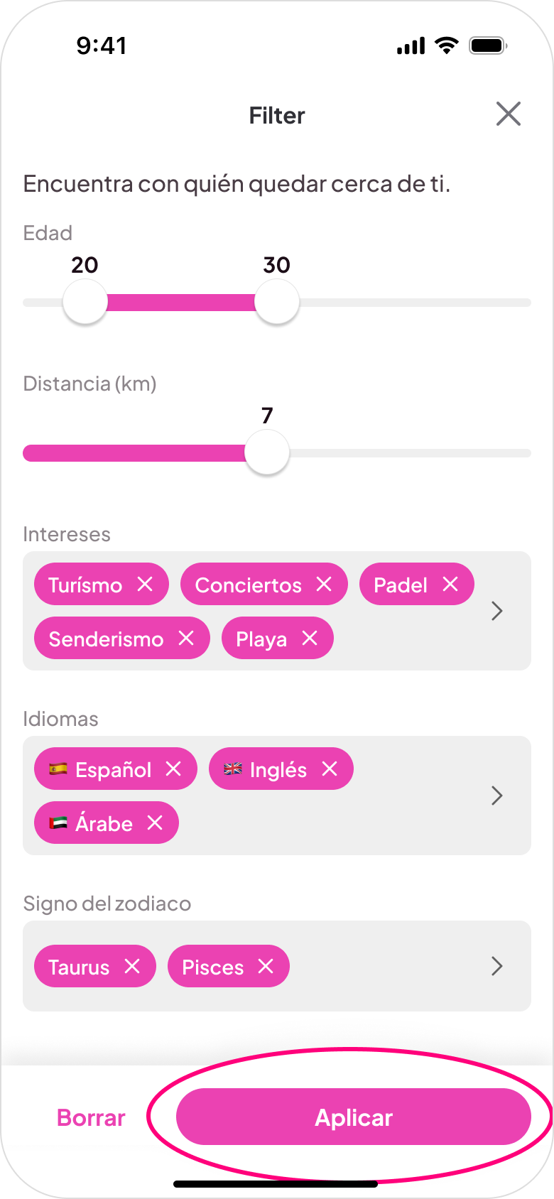
Step 4
Filtered results
Step 5
Start conversation
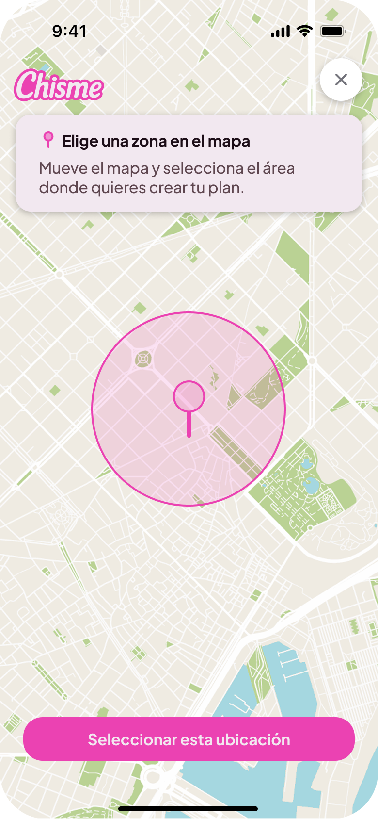
Plan creation flow
The creation flow lives on a single screen with no more than four inputs: activity type, date, time, and location. That constraint was intentional. If creating a plan feels like filling out a form, people won't do it. The goal was to make it feel as light as sending a message. Replacing the "+" icon with the CTA "Me apetece..." effectively doubled plan creation.
Step 1
Discover nearby plans
Step 2
Create a new plan
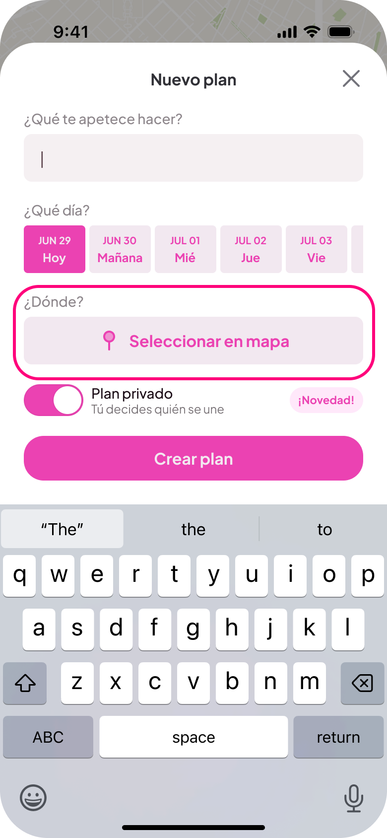
Step 3
Choose location
Step 4
Publish the plan
Step 5
Start conversation
Monetization
One of the harder product decisions was messaging. In most social apps, 1:1 messaging is free. But Chisme is built around group plans, not direct conversations. Group chats inside plans remain free; direct 1:1 messaging requires a subscription. This keeps the focus on shared activities while supporting the business model.
Growth & metrics
Chisme reached 20,000 monthly active users within four months of launch, through a combination of organic TikTok and Instagram content and Meta advertising. More than 300 active plans are currently running in Spain.
- 4.7 App Store (500 reviews)
- 4.5 Google Play (350 reviews)
Monetized through subscriptions covering premium discovery filters and direct messaging.
Learnings
Building Chisme changed how I think about the relationship between small design decisions and user behavior. Changing a button label or adding a pre-written message starter had measurable effects on how people actually used the product. That's not obvious until you see it in real data.
Co-founding a product also meant designing within real constraints: server costs, development time, two people building in their spare time after their day jobs. That changes how you prioritize. Not every idea gets built. You learn to identify which design decision actually moves the needle.
Designing for a women-only community made trust and safety central from day one. Verification, community standards, and patterns that felt safe enough to actually approach a stranger were foundational, not features added later.
Try it yourself
Chisme is available on both platforms.