I joined the DateMapper team to help create a curated map app that simplifies the challenge of choosing a date location in a large city. The app finds the midpoint between two users and recommends nearby spots tailored to their preferences. I led the UX and UI design of all core screens, collaborating closely with the founders, iterating based on user feedback, and ensuring a clear, mobile-first experience.
Role and Scope
I worked as the sole Product Designer on the MVP version of the DateMapper app. My responsibilities included defining the information architecture, designing all key screens, conducting usability testing, and collaborating directly with the founders. The goal was to create an intuitive mobile experience that feels both helpful and inviting.
Problem
Coordinating a fair and convenient meeting point is often guesswork. Users needed a tool that could suggest suitable locations based on both users' positions while also offering refined recommendations based on atmosphere or preferences.
Solution
Design an app that calculates a midpoint and overlays it with personalized venue suggestions. Create a seamless mobile-first interface that supports this concept while remaining elegant and easy to use.
Design Process
Research and Discovery
- Interviewed target users who often plan dates or meetups
- Compared existing tools like Google Maps and Corner app
- Identified missing features such as midpoint calculation and niche filters
Key insight
People want fast, reliable suggestions that feel personal and require minimal effort
Information Architecture and User Flow
The structure was designed to be simple and focused on conversion:
- Landing page: brief intro to the app with a call to explore
- Home page: dual input for starting points and venue preferences
- Results page: curated venues at the calculated midpoint
- Map view: interactive overview of venue locations
- Add venue page: form for event hosts or businesses to suggest venues
User flow
- Both users enter their locations
- App calculates midpoint and shows venue suggestions
- Filters help refine results
- Users view details and can share links to suggested spots
Core Screens
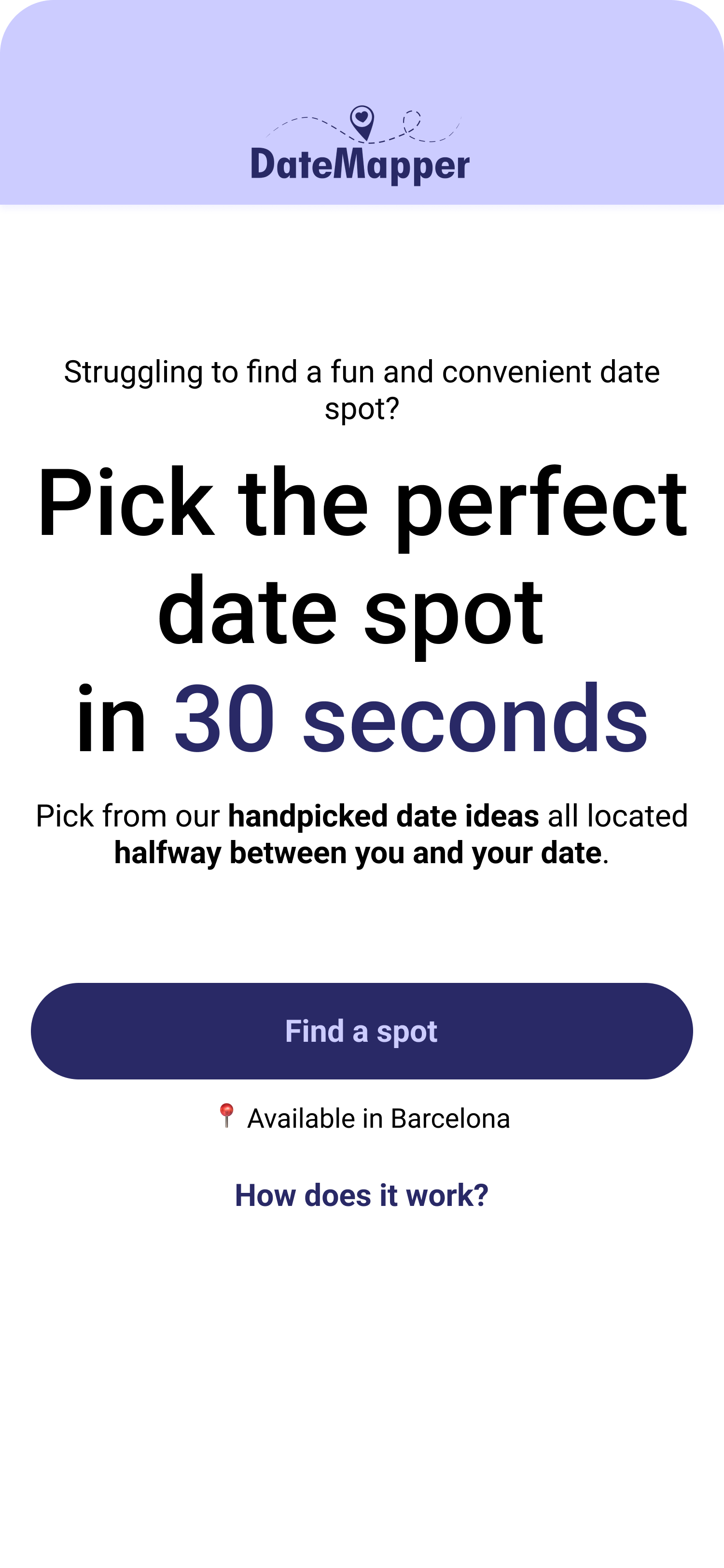
Landing page
Goal
Introduce the concept and encourage users to try the app
Design
Simple layout with a short explanation and clear call to action
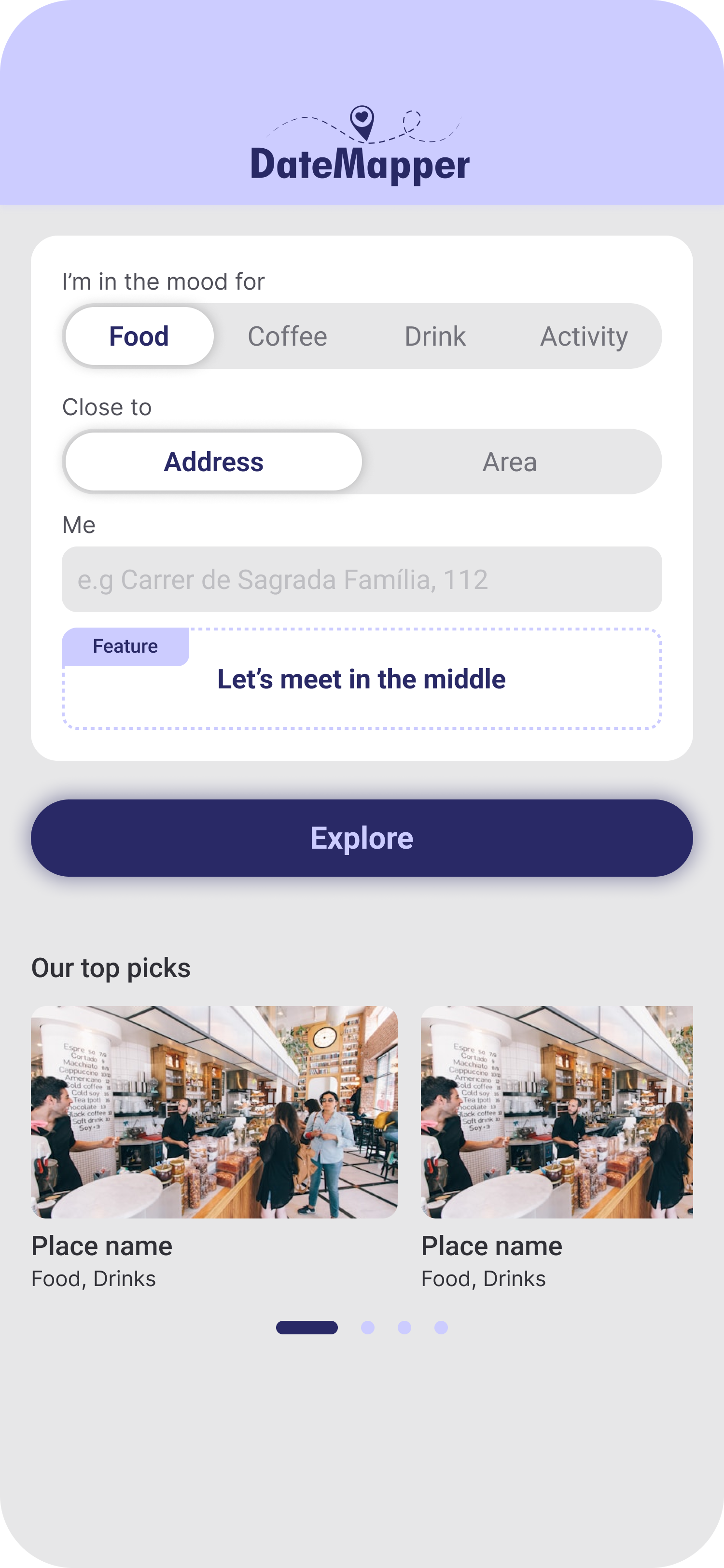
Home page
Goal
Allow both users to enter locations and see top suggestions
Design
Input fields for addresses, category filters, and pre-filled cards with trending venues and events
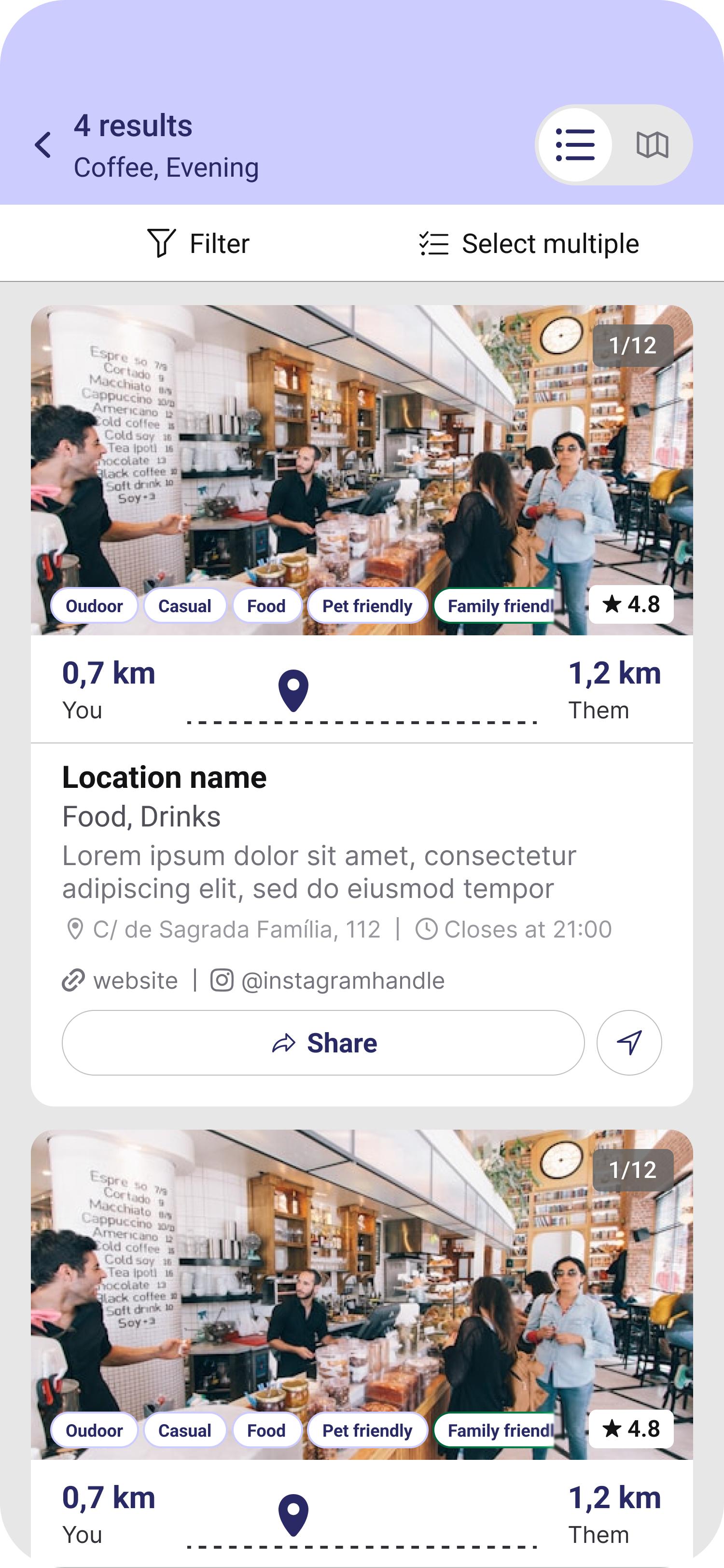
Results page
Goal
Present venues that match the midpoint and user preferences
Design
Each card includes images, description, hours, distance to each user, and call to action
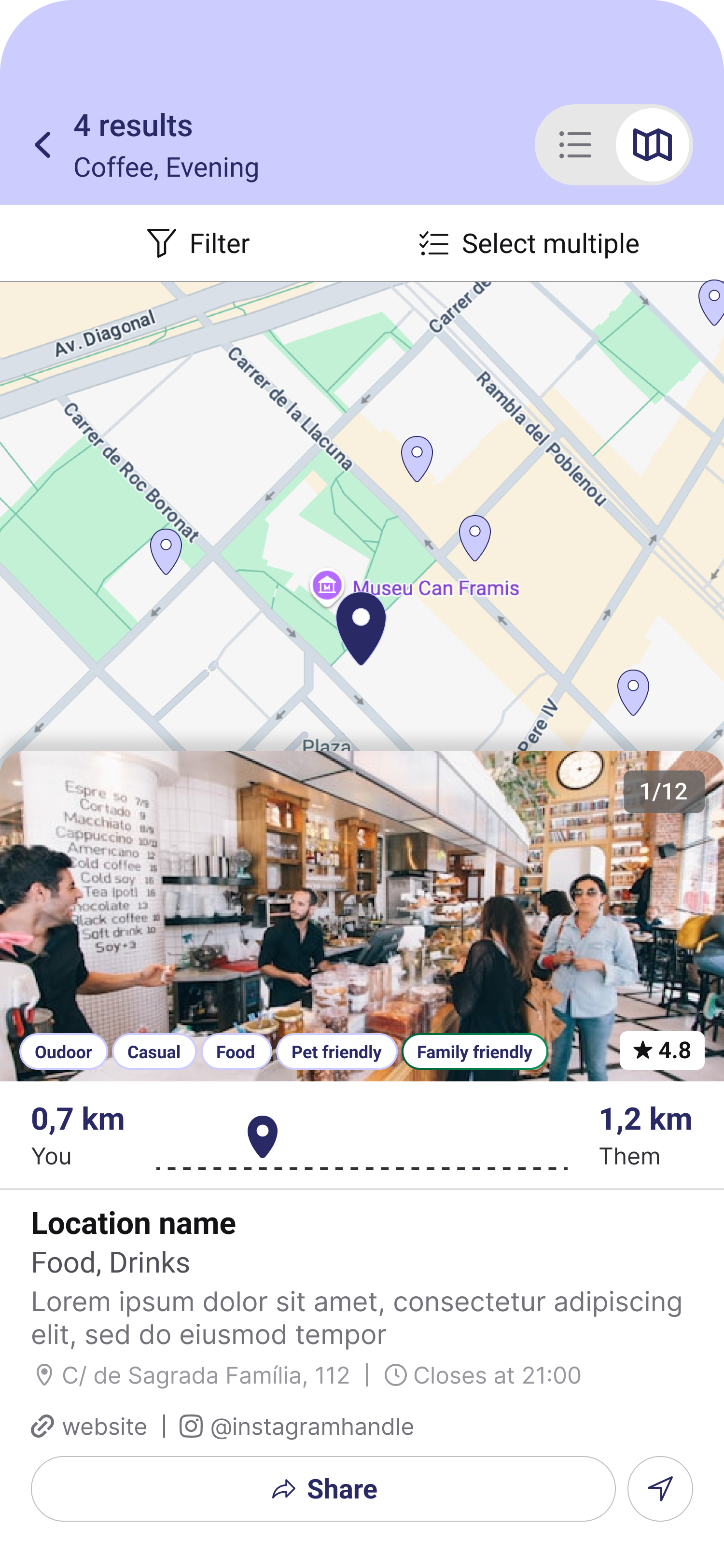
Map view
Goal
Visualize venues and midpoint
Design
Interactive map with user markers, midpoint pin, and clickable venue icons
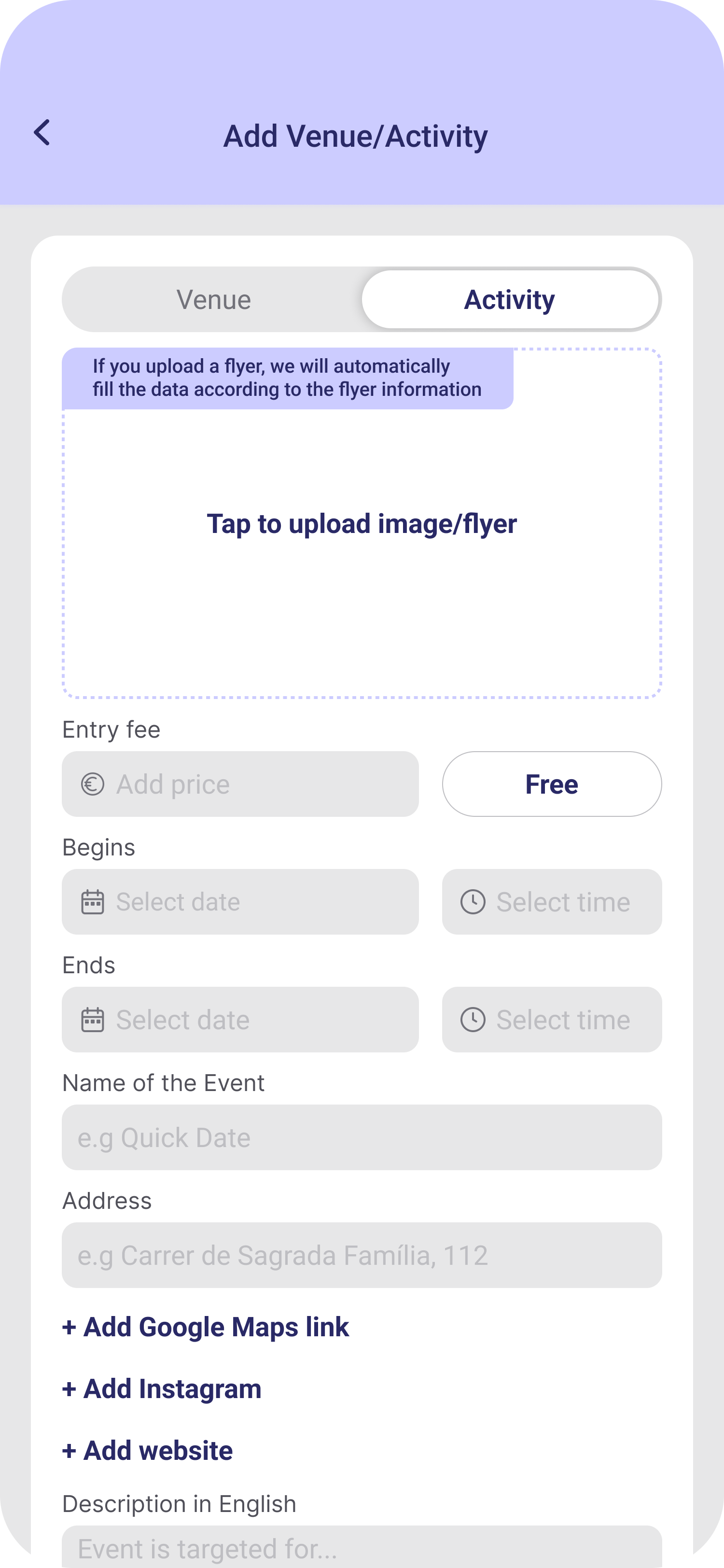
Add venue or event page
Goal
Let others expand the venue database
Design
Simple form with labeled fields for submitting new locations
Visual Design
- Colors: Neutral tones with calm accent colors to suggest warmth and clarity
- Typography: Readable friendly sans-serif with clear hierarchy
- Iconography: Custom icons to indicate key actions and reinforce app branding
- Components: Designed a small set of components (cards, filters, inputs) with consistent visual language and interaction logic
Testing and Iteration
Conducted tests with early users. Based on findings:
- Added niche filters (queer friendly, woman owned)
- Made distance indicators clearer and more relatable
- Improved microcopy for better clarity
Challenges
- Translating a fairly technical backend (midpoint logic) into something users can grasp quickly
- Balancing helpful UI with minimal distractions
Reflection
This project reinforced how well-designed tools can turn real-life challenges into simple interactions. Designing for mobile-first forced clarity and focus. Iterating with users and closely collaborating with founders helped us land on a product that feels meaningful, lightweight, and memorable, with a measured +35% lift in session duration.
Client Testimonial
"Without Martin, DateMapper would not have been able to get to where it is right now. He brought a high level of professionalism to the project, introducing a very structured and effective approach."
"He helped us make some initial quick wins to improve the UX immediately, while simultaneously putting together a long term plan. Martin adapted to our startup needs and timelines and made a clear impact. User stickiness and session duration went up significantly."
"We highly recommend working with Martin. Not only is he an outstanding professional, but also a pleasure to work with."